Friday, 29 May 2015
exporting my indesign file
over the past few days i have been having trouble exporting my Indesign file into a file that will play all my media and having page transitions. for example when exported as a interactive PDF my animations disappear from the scene disappear and the page transitions do not work.
when researching online and through trial and error I found that SWF files worked my animations sometimes and other time not at all.
I spend three days fixing the issues which involved keeping the SWF file and video files together and checking all the animations were started by a mouse click, instead of a touch/release of button.
After creating my SWF file i researched online on how to convert it for an Ipad but quickly found out that this is not possible as apple products dont understand this file format. next i checked if it was possible to work it on an android tablet but there also seemed to be issues with running it on my nexus. (i will look into this further after submission because i would prefer it on a tablet rather than an computer)
so i have concluded that I shall hand in my SWF file for it to be run on window/mac and after submission i shall look into putting it on tablet and changing the resolution size to be full screen on the computer.
Monday, 25 May 2015
Sunday, 24 May 2015
Artwork: First Page
this is the final image for the front cover. I changed the black border to the wooden table from the front cover image then placed my illustration on the right hand side.
Saturday, 23 May 2015
Artwork: front page
I wanted to add a bit more artwork to by book so i went back over my past research report and researched 17th century books to see what was common for the front cover as well as rediscovering 17th century artwork.
Friday, 22 May 2015
Animation: Flowers
after tackling some of the big objects to animate i thought it would be more immersive to make the smaller objects have a bit of motion.
Animation problems in Indesign
After creating my animations I was hoping that when i uploaded into Indesign there wouldn't be a problem but unfortunately when i uploaded the video file the videos contained a black fill around the animated object even though when it was exported there was a transparent background. after experimenting with various video formats and reading into Indesign about video files.
for example when i exported the animations as a GIF Indesign did not identify it as a video and was unable to play it.
I discovered that the only to logically fix the problem was to edit all with a background. Below is the before and after of what i had to do to my animations.
Thursday, 21 May 2015
Animation: Pestle and mortar
here is my second animation, for this I looked at videos of how a pestle and mortars are used properly so i had an ideas for the motion of the animation and how smooth it should be. I decided to make the animation quite rough because when these cooking instruments are used its not a seamless action to stir the pestle or a bashing action. below is the final animation
Clarification of Ebook program
Over the past couple of months I have been trying to narrow down the program i wanted to use for my Ebook at the end of this project. At the end of my research project(ba7) I had chosen on Kwikier, a third party Photoshop plug-in which had worked in previous tests when the was a maximum of 4 pages, me naivety believing it will be able to cope with creating more pages.
Unfortunately as the weeks have started to run out and the time had come to use Kwik I uploaded all my components but the third party plug-in had problems coding and publishing.
I then spent two days on InDesign hoping that this program might fix my problem. I was able to get the page transitions and folio overlays working on the Ipad but when I added my animations but a black box appeared around the animations making the scene unprofessional.
Personally I wanted my final project to be finished by this week but at this point that's not going to happen.
I will be seeing my tutor tomorrow so I hope I will be able to sort the problem by either using Indesign or by using a more unknown programs like unity or IBook
Monday, 18 May 2015
Artwork: Alleyway
The plague doctor is an essential villain in my historic fiction novel as he a manipulative and corrupt individual out to get as much money from the sick as possible for his bogus 'cures'. while my protagonist only wishes to help the sick from the pestilence in hope of being accepted by the community.
for my plague doctor I decided to place him down a narrow alleyway to isolate the view but easily direct the view to the character. so I got a reference of 'Devil's Alley' from Kings Lynn to help me with the perceptive and shading.
I wanted to give the impression of evening going into nighttime so i used a mixture of blues and browns to interpret this. also by having a dark environment it will give an air of mystery to the character.
now that I had a basic idea of my environment I started thinking about the appearance of my plague doctor. using my research from Ba7 I made a initial sketch which i then used to make show iterations.
I chose to use the plague doctor with the long beak as it seemed more historically accurate that the others. I also tried to add the plague doctors iconic stick but it didn't look anatomically correct so went back to the original
after asking my peers there opinion on the scene i was advised to try and brighten the light coming out the windows so plague doctor can have highlights over him making him more appealing to look at.
using a contrast of yellows and purples to lighten and darken the scene has allowed the muddy colours i had before to stand out more
I then started picking out colours from the environment to colour in the plague doctors coat and hat. I also added some fog to give the feeling of mystery and spookiness. As well as looking into detailing of the environment.
Sunday, 17 May 2015
Tuesday, 12 May 2015
Animation: myrrh
For my work desk I have decided to add a small animation to the items in the scene so the player knows that the item has been selected
Monday, 11 May 2015
Artwork: Book Glow
for my reader to know that there is an image or scene to be seen i needed a button that wouldn't distract the reader but would be attract the readers curiosity. Im going for a fog or magic look so that when the book glide downwards off the screen there s a soft edge separating the book and the main image below are some variations of a foggy/ whimsicallooks
in the end I decided to go with this subtle fog effect below as its not as bring as some of the other looks but it still quite defined.
Sunday, 10 May 2015
Artwork: apothecary shop
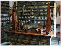
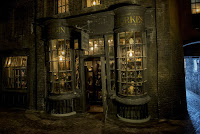
After writing the description for the apothecary shop i was instantly reminded of the Borgin and Burkes dark magic shop in the 'Harry Potter' series so for reference i read extracts from the chamber of secrets, looked at the film and Pottermore's interpretation for perspectives and lighting as I wanted the shop to feel busy and dark.
01.jpg)

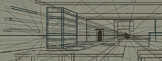
first I set out my horizon line and two-point perspective
then I set out the basic outline of the room and big objects.
using a colour palette influenced by the Pottermore Borgin and Burkes shop i started to shade and colour the shop.
then added appropriate items into the shop
I decided to experiment with the back wall colour because the dark colour pallet was making the image look flat. i decide to pick a bright yellow which was able to help the perspective but on the other hand it brightens the scene so much, that it changes the mood of the scene from a gloomy atmosphere to a bright happy mood.
Instead of brightening the back wall I used a lighting effect on Photoshop to darken the room and add a spotlight to the scene which finally gave it a moody atmosphere.
now the lighting was correct I went ahead and detailed the items in the shop properly.
Below is the finish piece. When the rest of my artwork is complete I am hoping to animate a few items in the shop to bring more life into the scene
Thursday, 30 April 2015
A physicians workdesk
I wanted to create a work desk that would allow the reader to learn more historic fasts without them feeling forced to read it.
i did some quick research on 17th century desks and work spaces, items that would have in that time as well as potion rooms to looks at colours and items.
Below is the progression of my workdesk:
First I set about pixelating the potions mini game above to get a nice colour pallet for my own art piece. i then set up the basic work station looking at the colour and size.
I start drawing out ideas of where objects might be placed like books.
I began to contemplate the light source so i create my candle so i would always have a clear idea how the light will fall on other objects.
Objects were outlined, shaded then coloured.
My colleague T. Navikas created the four objects in the foreground which look fantastic! while I finished the shadows.
This is the final image:
Saturday, 18 April 2015
Artwork: Book Backgrounds
to create my book pages spent time looking a images of books and old paper texture to understand the shape and colours to make the book. below is:
first version of open book
final version of open book
first pages of book
first page of book
front cover.
Saturday, 11 April 2015
business cards
for my business cards i wanted to do an unique design for them instead of using one of my final pieces from my university project in hope that it will show more of my personality and range of artist skills.
when i did reserarch into business cards i found that the majority of them used an animal or creature to represent their personality. so i did a few sketches of wolves (as i have a tattoo of one) and a fox because i have gingery hair and im an adaptable person. i looked at having a realistic style or cartoony. but i felt like even though i connected to these animals i could find something more unique.
I thought about the pets i have had over the years and came to the conclusion that to have one of my ferrets in my business cards would be funny and adorable. as a pet they are very curious, playful and full of energy.
so i started to sketch out a few ideas to include a ferret.
below is the official mock up
i started to go into detail on painting my ferret trying to create a mixture of realistic and cartoon-y
after finishing the ferret i went ahead to do a self portrait.
i wanted to create a disney style for myself as i love disney movies and the way they are drawn plus it would give me quite a feminine aesthetic.
i took quite a few reference photos to get the pose correct as it was quite difficult to find a similar pose online. below are two alternate version as i have dyed my hair blonde recently but it is originally ginger.
here is the finished version:
Subscribe to:
Comments (Atom)


