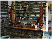
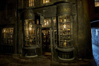
After writing the description for the apothecary shop i was instantly reminded of the Borgin and Burkes dark magic shop in the 'Harry Potter' series so for reference i read extracts from the chamber of secrets, looked at the film and Pottermore's interpretation for perspectives and lighting as I wanted the shop to feel busy and dark.
01.jpg)

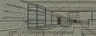
first I set out my horizon line and two-point perspective
then I set out the basic outline of the room and big objects.
using a colour palette influenced by the Pottermore Borgin and Burkes shop i started to shade and colour the shop.
then added appropriate items into the shop
I decided to experiment with the back wall colour because the dark colour pallet was making the image look flat. i decide to pick a bright yellow which was able to help the perspective but on the other hand it brightens the scene so much, that it changes the mood of the scene from a gloomy atmosphere to a bright happy mood.
Instead of brightening the back wall I used a lighting effect on Photoshop to darken the room and add a spotlight to the scene which finally gave it a moody atmosphere.
now the lighting was correct I went ahead and detailed the items in the shop properly.
Below is the finish piece. When the rest of my artwork is complete I am hoping to animate a few items in the shop to bring more life into the scene


No comments:
Post a Comment